
Project Overview
Best Fleets to Drive For® is an annual survey and contest that identifies the for-hire carriers providing the best workplace experiences for their drivers.
October 2023 - December 2023
Jane Jazrawy: Project Management
Berenice Zepeda: UX UI Designer, Creative Direction
Alex Pineda: Illustrator, Designer
Kostek Voi: Web Developer
Mark Murrel: Marketing/ Copywriting
Redesign the existing website to facilitate a simple, straightforward platform where drivers can nominate the fleets they work for as the best in Canada and the United States. The redesign will prioritize user-friendliness, ensuring drivers can easily navigate and interact with the site to submit nominations and engage with related content.
User Personas
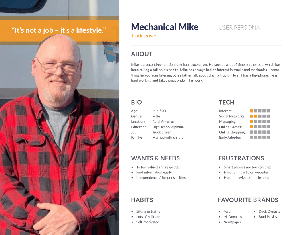
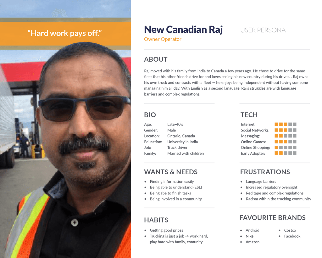
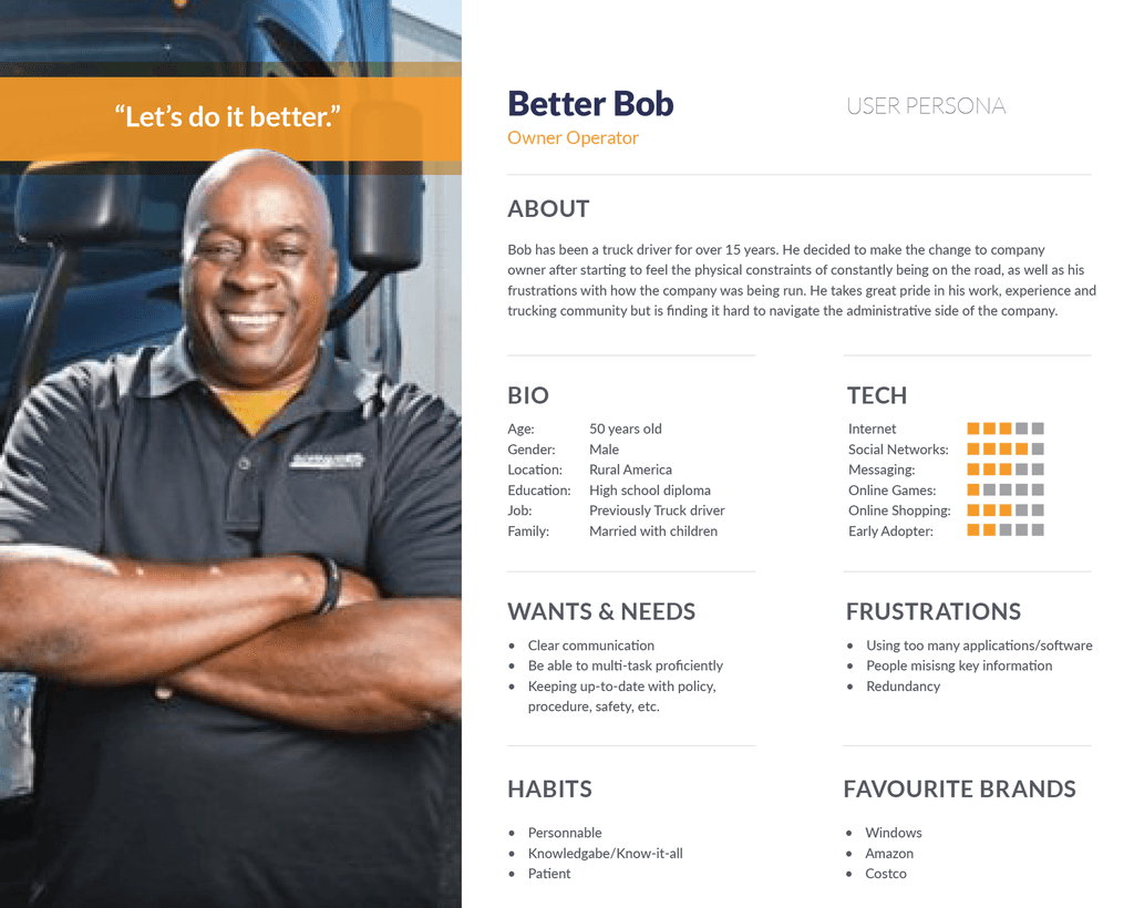
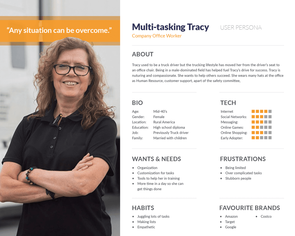
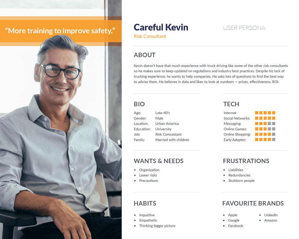
Personas' Designed by : Jenny Tieu
User Pain Points
Many truck drivers might find it challenging to navigate through digital interfaces, leading to frustration and incorrect data entries. Simple and intuitive interfaces are crucial to alleviate this issue.
Truck drivers may not always have access to a stable internet connection or the latest devices, making it difficult for them to participate in online surveys. Solutions should consider offline capabilities and compatibility with older devices.
The demanding schedules and long hours on the road leave truck drivers with little time to engage in additional tasks like filling out surveys. Survey programs need to be quick, easy to understand, and respectful of their limited free time.
Information architecture

UI Design
Objective:
Redesign the current website to present a more simple, neat, and elegant interface that reflects the themes of awards, trophies, gold, and podiums. The goal is to create a user-friendly and visually appealing experience that communicates excellence.
Design Elements
Color Scheme:
Gold and White: Utilize gold as the primary accent color to symbolize prestige and achievement. Pair it with white to maintain a clean and modern look.
Navy Blue: Incorporate blue to contrast with the red and white for call to action.
Primary Text:
Secondary Text:
Call to Action
Iconography:
Typography:
Brand's Fonts: Use bran's typography for consistency: Impact & Anton.
Readability: Ensure body text is clear and easy to read with appropriate spacing and font size.
Headline Text - Anton
Text - Lato
Imagery and Icons::
Award Imagery: Incorporate high-quality images of awards, trophies, podiums, spot lights and ceremonies to visually reinforce the theme.
Custom Icons: Design custom icons in gold tones for various functionalities like navigation, awards categories, and user actions to maintain a cohesive look.


Layout and Navigation
Simplified Navigation
Create a streamlined navigation menu with clear categories and subcategories to make it easy for users to find information quickly.
Responsive Design
Ensure the layout is responsive, providing an optimal experience across all devices, including desktops, tablets, and smartphones.

Wireframes Hi-Fi Prototype


Homepage
Hero Section
Feature a prominent hero section with a stunning image of a award sign, accompanied by a tagline that captures the essence of program.
Menu
The menu should be simple and understandable for user, as well as with iconography support for accessibility.


Content Sections
Past Winners
A dedicated page to showcase past winners by year.
Resources
A full resources menu to learn, know more or get to know more about the program

User Experience (UX) Enhancements
based on pain points
based
Quick Access Links
Quick access links to the most visited sections, such as "2024 Results" and "Nominations open".
Interactive Elements
Incorporate interactive elements like hover effects on buttons and links, providing a tactile and engaging experience without overwhelming the user.
Readability & Accesibility
Improves the readability by using a more legible typography and making sure color scheme has enough contrast.